


Silpo is a network of grocery supermarkets in Ukraine. In addition to offline stores, they have their website and mobile application where you can order delivery of goods, get acquainted with promotions and events, use your discount card, and find the nearest store
A shopping list feature was designed as a creative challenge for an existing mobile application. It could be helpful for customers to plan their purchases and remember to buy everything they need, thus increasing the profit for the store
I conducted UX research, audited the website and app of Silpo, built an interactive prototype, and designed the shopping list section in the app's design system
For this project, I chose the User-centered design process, which consists of 4 main steps:

To understand how the user experiences the product or similar products, I conducted 10 user interviews and studied applications of competitors with similar functionality.


From the competitive environment known for quite convenient applications, I chose Rozetka and Zakaz.ua
From the competitive environment known for quite convenient applications, I chose Rozetka and Zakaz.ua

I identified the strengths of the Rozetka app are:
Zakaz.ua has a convenient product catalog with attractive photos of products. It is also possible to keep the product in the list as you like and in the shopping list.
The disadvantages of this application include too many clicks to add the product to the list


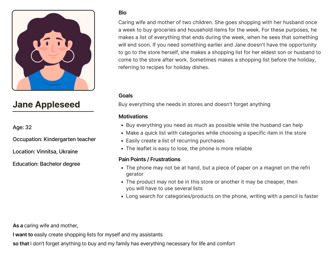
To Specify the user’s needs I created 2 user personas and wrote a user story for them.
Personas are critically different from each other: the first persona creates a list so as not to forget to buy everything you need if a trip to the store involves a lot of goods. Another persona is a person who is instructed to buy what ended up at home, for example, on the way home from work.


I started designing the solution with a low-friendly interactive prototype in Figma, where I structured the functionality of the future section of the application.
To evaluate the solution I tested the prototype with 3 people. While testing I discovered that I missed system feedback, so I added it with popups.


Finally, I designed the interface of the shopping list in the design system of the Silpo app.
The elements that I used to create the section I collected in a UI kit.


In order for the product to be included in the shopping list, simply click on the button next to the interested item in the promotions section, on the website or in the scanning window of the product.


At the moment, despite the great variety of mobile applications, many users still use paper to create shopping lists. Although of the people I interviewed, all said that the creation of lists is 60-80% the same. I believe that the problem is primarily in the habit, which is our task to form, and the speed of creating lists.
In order to encourage people to use the convenient feature of the application, the task of creating a list should be made as easy as possible.
I suggest entering categories written in the user's language. That is what can be seen in ordinary lists created with pencil and paper. For example, milk, bread, kefir ... At the same time, application will be a much more powerful tool due to the ability to add a product with extended description, and photos of the product. In addition, the user will be sure that such goods are exactly in the store, and therefore even a child can handle the order to buy something.
Another advantage is the automatic calculation of the cost of purchases so you can estimate in advance how much money to take with you.
The ability to send the list to the husband in any messenger will make the application a favorite of many housewives.

Contact me in any social media from menu or send me short description of your idea